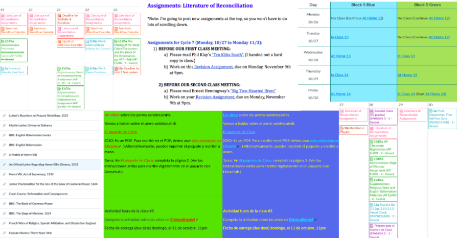
While the adjustment to hybrid and distance learning has presented challenges, Canvas has proven to be a helpful tool in improving this difficult transition for both students and teachers.
Faculty and students alike are utilizing Canvas in different ways this semester. Steve Kaback explains that Blake gave teachers a uniform structure for their Canvas pages to increase accessibility. Required features include the buttons and meeting schedule at the top of the home page. However, he adds, “There was still a lot of latitude for individual teachers to design their Canvas page in a way that they like.” Daphne Dresner ’24 adds, “Some teachers are really good at the web designing.”
Maia Chavez ’21 notes that clearly indicating where assignments can be found on Canvas has been the most efficient. She says, “I think it is useful because it is all [in one place].” Nonetheless, Chavez mentioned that becoming accustomed to the new Canvas page formats, given all of the changes this semester, can be challenging for some students. Chavez speaks to some inconsistencies, stating, “At least for me, all of my teachers basically use the same place. A downside is that for those people only looking on the calendar, itís not all on [there].” This can cause frustration because students need to check a different section of Canvas for each class.
Canvas pages, when well executed, strike a good balance between the required Blake structure and the teacherís own set-up of their course page. In this time of uncertainty, Kaback explains, “I tried to make sure that questions could be answered just by going to the landing page and that you could have more detail one click away… I hope that students are using the Canvas page to quickly orient to what is expected in class and at home.”


